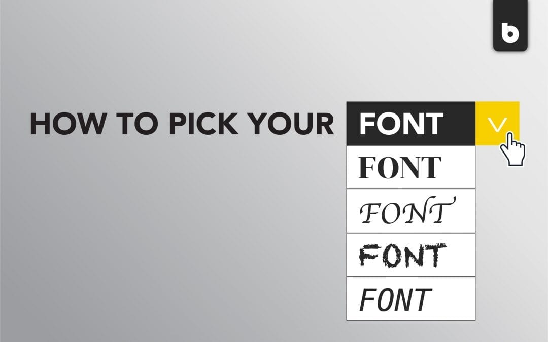
You’ve officially figured out your color scheme and logo design, and it’s time to pick your font. Seems like a daunting task, right? There are hundreds of thousands of them in the world, and you have to pick the one that fits your business perfectly. That sounds terrifying, but don’t worry, it doesn’t have to be.
There are 4 main font families, each of which has a purpose they work best for. Once you narrow it down to the family of fonts you want to choose from, it’s a much less terrifying process to pick the right one. But how do you go about choosing the right font for your logo?
1. Know your business.
This may seem like a strange way to start looking for a font to use for your logo, but it’s a key element in the process. Different typefaces work best under different circumstances. It’s important to keep in mind what your business offers so your logo accurately represents what clients can expect. If you own a law firm, you may not want a bouncy or bubble-letter type font, because in all honesty, a law firm probably isn’t the place for fun and games. Instead, an angular and traditional-looking one would fit better with the professionalism of the company and the work itself. Understanding the type of environment your business creates is vital to choosing the right font.
2. Consider the vibe your logo gives off.
Just like the vibe of your business, you should determine what kind of feeling your clients will get from your logo. If your logo has a lot of bright, fun, and eye-catching colors, a font with thicker lines and a lot of contrast will stand out the most against your logo rather than being overshadowed by the color scheme. Additionally, most logos use Serif fonts – learn more about those and the other three families here – but you aren’t absolutely limited to that family. Creative businesses benefit from Script fonts as well. In any case, keep in mind the space you have available on your logo for the lettering. As beautiful as a font may be, it’s important to make sure your clients can actually read what you’ve written.
3. Find a font that speaks to you.
Whether you know it by name or not, you probably have a favorite font. Believe it or not, they cause people to feel a certain way about what they are reading. Those feelings are a great thing to keep in mind when choosing the font for your business. In fact, everyone on our team here at Blackwood has a favorite:
Kyle – Helvetica, Gotham August – Futura Maddi – Comfortaa
Cassie – Charter Lindsay – Calibri Dillon – Montserrat Jony – Uni Sans
Our different roles here at Blackwood have an impact on our favorites, but each font also gives us a certain feeling when we read it. Kyle’s favorites are Helvetica and Gotham because of the many weights (or line thicknesses) and their versatility. Jony, who works with graphic design, loves Uni Sans because of the contrast and the capitalization. Ultimately, when you’re looking for a font to use, recognizing the positive feeling it gives you and its benefit to your company is a huge indicator that you’ve found the right one.
Still not feeling the warm fuzzies about any font you’ve tried? No worries – Blackwood can work with you to create a custom font for your business. Contact us today and let’s create the perfect font together.

