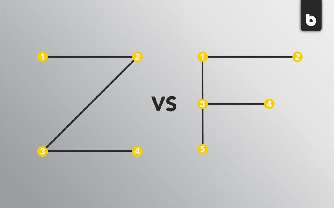
What could two random letters of the alphabet possibly have to do with web design? It’s pretty simple: they’re just visual representations of the way a person’s eyes trace a website. They may not stand for anything (although you’re free to make something up), but they’re still very helpful to know as you design a website for your business.
What is the Z-Pattern?
The Z-Pattern is a web design format that is meant to direct the path of the viewer’s eyes. Using this format, the eyes track from the top left to the top right, then diagonally to the bottom left and across to the bottom right. Your most important information should follow the “Z”: your company name, subpages, contact information, and so on. That way, because those links are accessible and stand out, the viewer is more likely to take action on your website.
What types of web pages benefit most from the Z-Pattern?
Typically, the Z-Pattern is good for emphasizing a few key elements, so this pattern is better for simple designs with less information. But there are exceptions to every rule! To include more information, you can extend or repeat the Z vertically to create a zig-zag. The reader’s eyes will still follow the path of information. If you’re trying to get more clicks, though, less information will serve you better with this layout.
Why should you use the Z-Pattern in your web design?
This pattern will be most beneficial to you if you’re trying to get people to subscribe to a mailing list or start using a service you’re offering. Additionally, if you have a few key elements to emphasize about your business, such as products or services you specialize in, the Z-Pattern will draw attention to those. If this sounds like something you’re looking for, then the Z-Pattern is probably for you! If your website is a bit more information-heavy, you may benefit more from the F-Pattern.
What is the F-Pattern?
The F-Pattern is a format for web design rooted in science: it doesn’t force the reader’s eyes to go anywhere, but conforms to the natural way a viewer looks at a website. Essentially, the readers’ eyes gravitate towards the left side of the website and rarely travel to the right side.
What types of websites benefit most from the F-Pattern?
Websites with a lot of content or blog posts benefit greatly from the F-Pattern, as long as the titles are bold and eye-catching. The F-Pattern encourages readers to scan the content of the page; it’s vital that you’re making efforts to drive clicks and engagement with your content.
Why should you use the F-Pattern in your web design?
The F-Pattern makes your website easy to read because it doesn’t force your reader’s eyes to go anywhere. Rather, the information is easy to read and retain because it feels natural to your readers. With this pattern, you’re saving your audience from having to try too hard to understand what your website is all about. However, if this pattern becomes too repetitive, the reader may lose interest. Throw a little curveball at your audience! Add in an element that doesn’t quite line up with the rest of your web page, like a call to action block or photo on the right side of the page. Your reader will be intrigued by the change of pace and pay more attention.
Feeling confident in your web design alphabet? Go forth and conquer that website! If you’re not quite ready yet, no worries – contact us here at Blackwood Creative. We know what we’re doing when it comes to designing websites, and we’d love to work with you on yours. Let’s design something remarkable together.
updated January 9, 2020

