Fonts may be one of the last things you think of when it comes to advertising your business. But just like colors, fonts have feelings that they convey to the viewer. It can be difficult to choose the right font for your project, especially when there are so many to choose from. Luckily, they all fall into 4 different font families – and you don’t have to be a typography expert to know which font is most appropriate for your particular business.
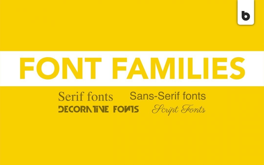
1. Serif
Sometimes referred to as the older style of fonts, the Serif family is home to fonts like Times New Roman and Baskerville. Usually, body text is the best use for Serif fonts. However, the logos for Google and Rolex both use Serif fonts, so that’s also a possibility.
The fonts in this family typically have little tails at the end of each letter; many people stand by their belief that the tails of the letters make the text flow together and improve the overall readability of the body. As the times change and more people gravitate to the straighter lines and cleaner edges of Sans Serif fonts, this has sparked a debate among writers and other frequent font-users.
2. Sans Serif
As we mentioned before, Sans Serif fonts are known for their straight lines and clean edges. There are no tails on Sans Serif fonts, and this family includes fonts such as Helvetica and Verdana. Nowadays, they are becoming more popular and more widely used as people tend to prefer their look and versatility.
Sans Serif fonts can absolutely be used for body text. However, because of the weights of the bolder versions of these fonts, they are also great for titles and headlines.
3. Script
Script fonts are definitely much different than Serif or Sans Serif fonts because of their organic, natural flow; they tend to look like handwriting. Snell Roundhand and Brush Script are two of the most popular Script fonts.
Typically, creative businesses and coffee shops prefer fonts from this family. This is because the unique look of the font emphasizes the individuality of each product that those businesses sell, and the hand-written appearance gives a welcoming feel to the logo.
4. Display
Finally, Display fonts are very, very decorative fonts. These fonts are usually used very sparingly in marketing materials or one-time uses on special occasions. Wingdings is the most extreme and recognizable Display font – it’s literally composed of little doodles in place of letters.
Though this isn’t the case for every Display font, most of them are difficult to read. For this reason, they’re best for a headline on a brochure or as the focal point of a social media post. They’re not great for small spaces, because they would be even less legible in smaller sizes. However, they can be fun, so just use them wisely!
Haven’t found the exact font you’re looking for even after scouring all 4 font families? No worries – Blackwood can create a custom font for your business. Contact us today and let’s create something font-astic.